Case study · 01
Mugger City.
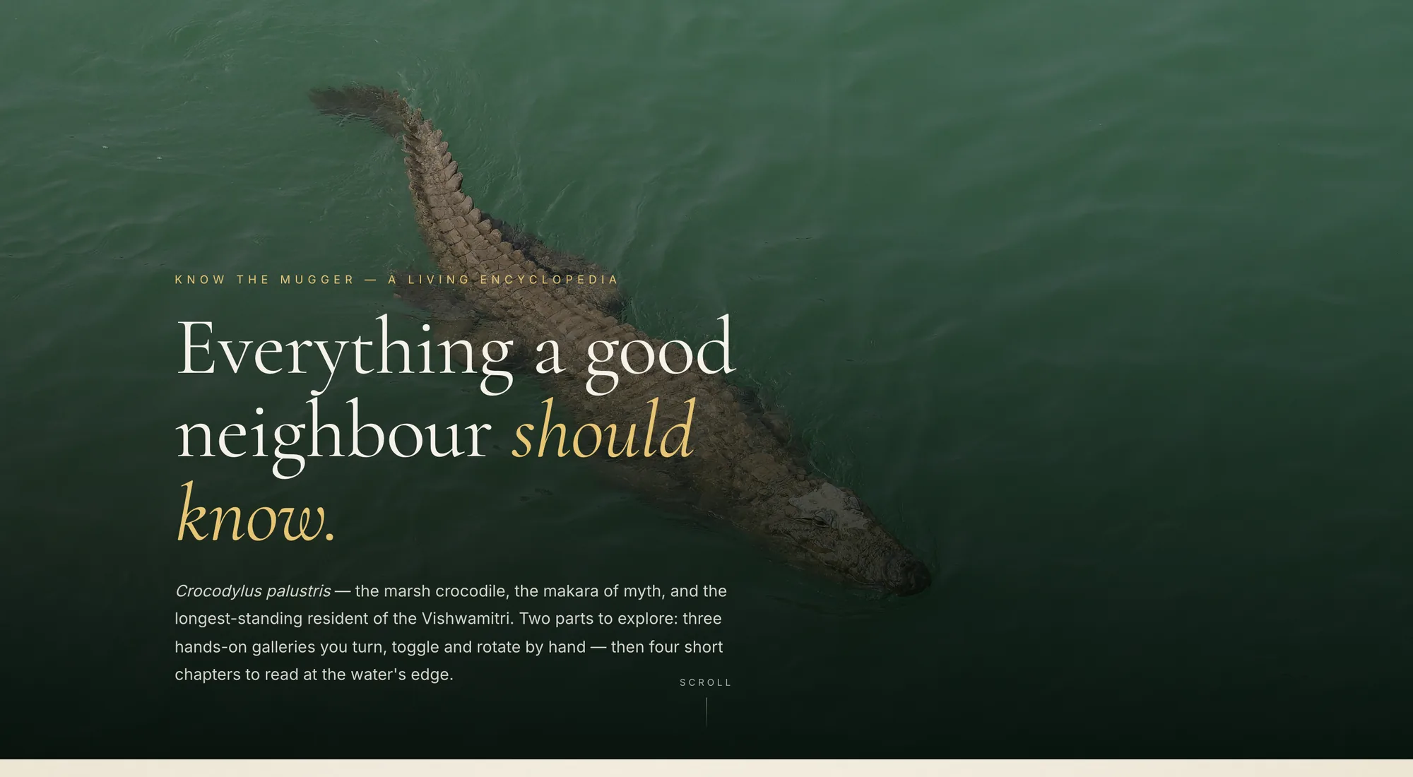
A digital field guide to the wild mugger crocodiles of the Vishwamitri — roughly three hundred of them, sharing twenty-four kilometres of Vadodara with two and a half million people.
What it is
Three hundred wild crocodiles. Two and a half million people. One river.
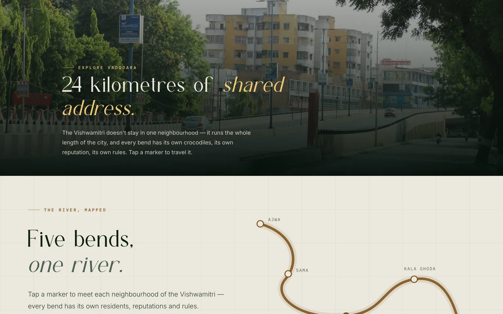
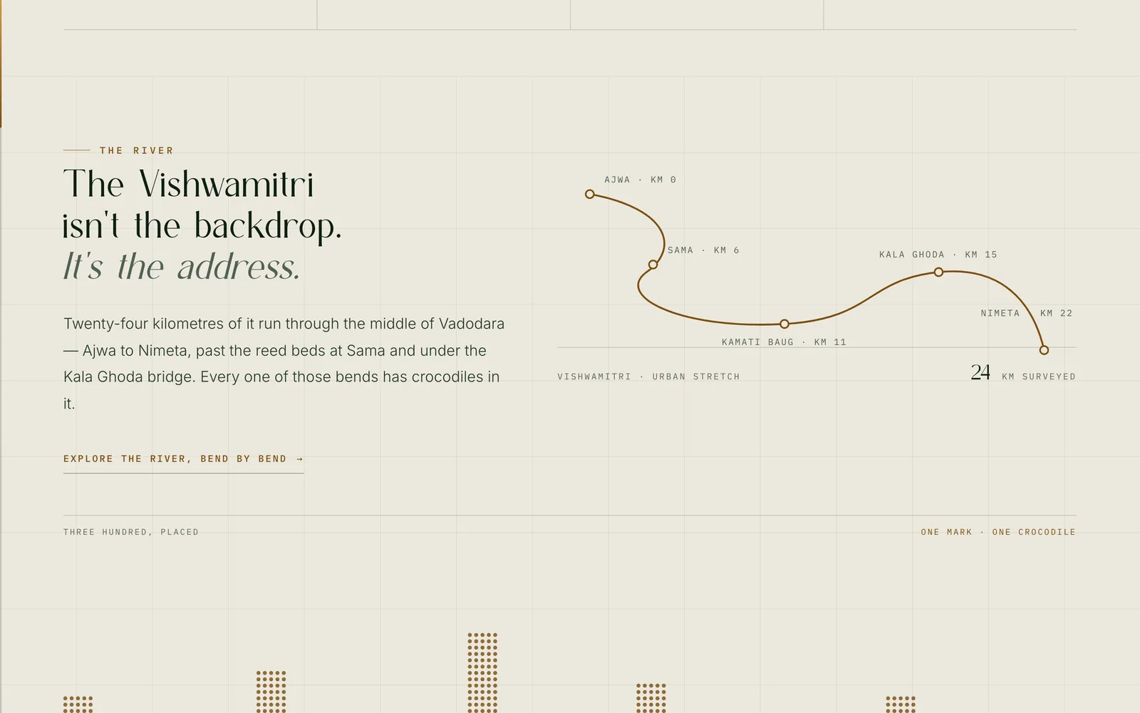
The Vishwamitri runs for twenty-four kilometres through the middle of Vadodara — past Ajwa, the reed beds at Sama, Kamati Baug, the Kala Ghoda bridge, out to Nimeta. Mugger crocodiles live in it. Not in a reserve on the edge of town, not behind a fence: in the river that the city’s bridges cross on the way to work.
Mugger City is a site about that arrangement. It maps the river bend by bend, explains the animal, and sets out what six centuries of sharing a riverbank actually looks like — including what to do if you meet one.
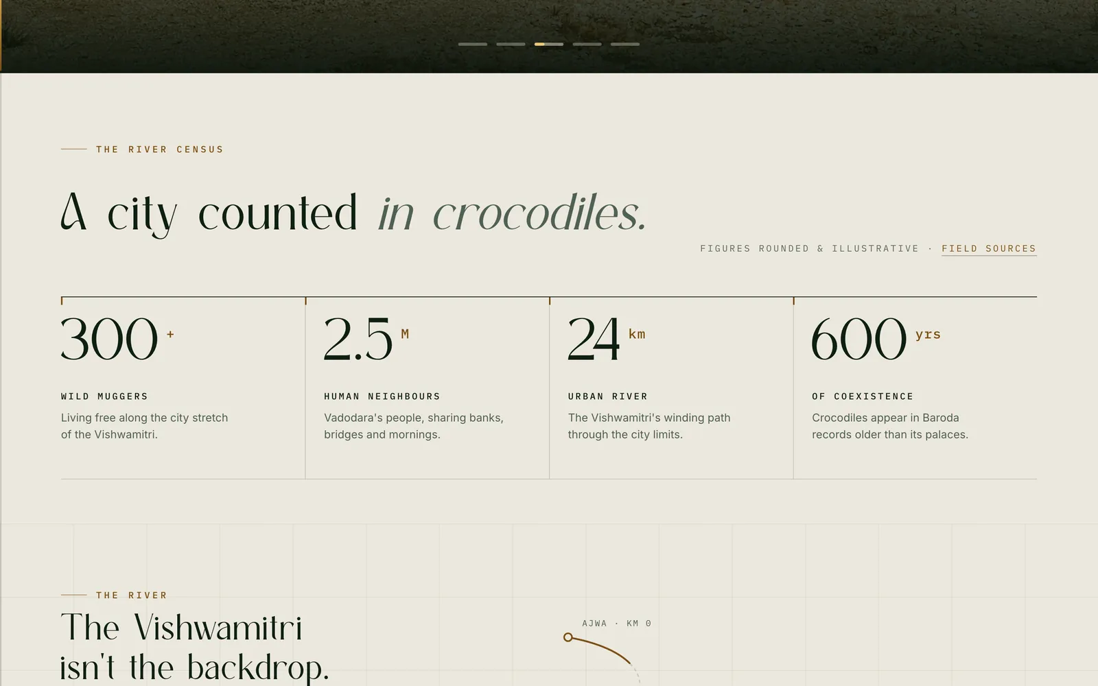
Living free along the city stretch of the Vishwamitri.
Vadodara’s people, sharing banks, bridges and mornings.
The Vishwamitri’s winding path through the city limits.
Crocodiles appear in Baroda records older than its palaces.
Figures as published on the site — rounded field estimates, not a headcount
The problem.
The crocodiles are not a secret. They surface every monsoon, in footage of a rescue team carrying a taped-up mugger back to the water, and in the stories that travel with it.
The trouble is that a rescue clip is an incident. It arrives without the river, without the animal, and without the six hundred years that make the incident unremarkable. A person can see a dozen of them and still not know why there are crocodiles in Vadodara, where along the river they live, what they do all day, or what to do when one is on the road in front of them.
So the brief was not “make a website about crocodiles”. It was: give the scattered thing a shape — somewhere the animal, the river and the arrangement between them sit in one place, in an order that holds.
The design direction
A field guide, not a campaign.
A conservation campaign asks for something. A field guide hands you something and gets out of the way — and a guide is what the subject actually wants, because almost everything here is specific and checkable: a species, a measurable stretch of river, named neighbourhoods, a nesting season, a legal schedule.
That decision set the whole surface. Restrained typography with a serif doing the talking. Field-notebook labels — record numbers, kilometre marks, dates — carrying the structure so the prose doesn’t have to. Photography given room instead of being cropped into decoration. Nothing that shouts.
It also set the tone of the writing, which is the part that does most of the work. “The mugger keeps banker’s hours.” “The famous grin that alarms tourists is really just a thermostat.” Dry, specific, faintly amused — because fear is the thing standing between a reader and the subject, and you cannot argue someone out of it. You can only be so matter-of-fact that it stops seeming warranted.
How it’s ordered
The structure came out of writing down the questions a person actually arrives with, in the order they arrive in. Not “chapters of a book about crocodiles” — the questions.
They turn out to fall into two halves. The first three are curiosity: why here, where exactly, what is it. The last three are stakes: what happens when it goes wrong, why does it matter, what can I do. Curiosity has to be satisfied first, because nobody reads the safety page of a subject they have no feeling about.
-
Why are there crocodiles in a city?
/coexistence.htmlSix hundred years, the makara in temple carving, and one documented night in Malataj. The ten-minute read.
-
Where along the river are they?
/explore-vadodara.htmlFive bends with kilometre marks, each with its own residents and its own character. Geography as the index.
-
What actually is a mugger?
/interaction.htmlThree galleries to handle, then four chapters to read. The species section.
-
What happens when one ends up in my street?
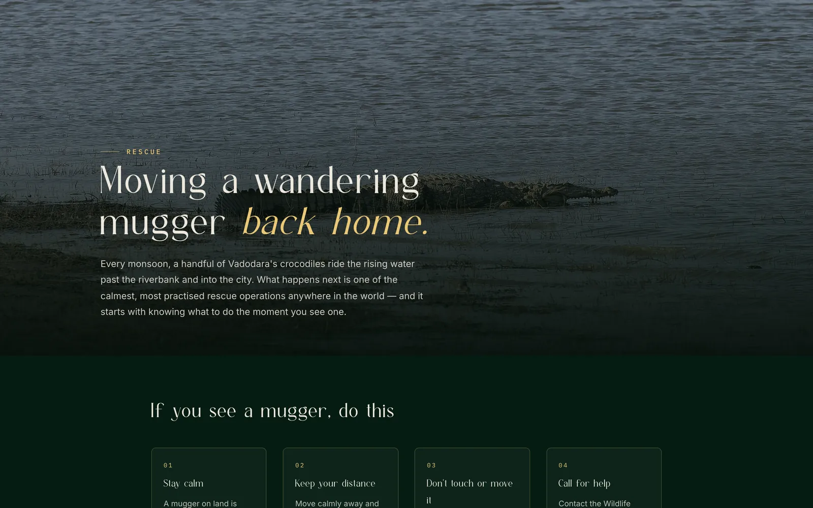
/rescue.htmlThe four steps, the numbers to call, and what the rescue crews actually do. The only page written as instructions.
-
Is any of this at risk?
/conservation.htmlIUCN Vulnerable, Schedule I, the three real pressures — and the riverbank code, written down for the first time.
-
Can I be part of it?
/community.html·/shop.htmlA wall to contribute to, and a small shop. The two pages that ask for something rather than handing something over.
Nothing in that list is the homepage’s job. The homepage is a trailer: the three numbers, the river as a drawn line, a day in the life, five dossier records, and the monsoon. Every one of them ends in a door to the page that carries it properly. It is the only page on the site allowed to be shallow.
What it’s built from
Eight pages. Each one answers a different kind of question, which is why there are six of these rather than one long article — the question “where are they?” and the question “what do I do right now?” want completely different pages.
-
The river, mapped
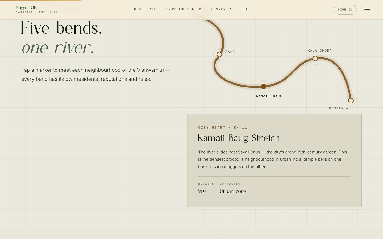
Five bends — Ajwa, Sama, Kamati Baug, Kala Ghoda, Nimeta — each with its kilometre mark, its character and its own recorded minimum. Geography becomes the index: “where” is the first question anyone actually has.
-
Know the Mugger
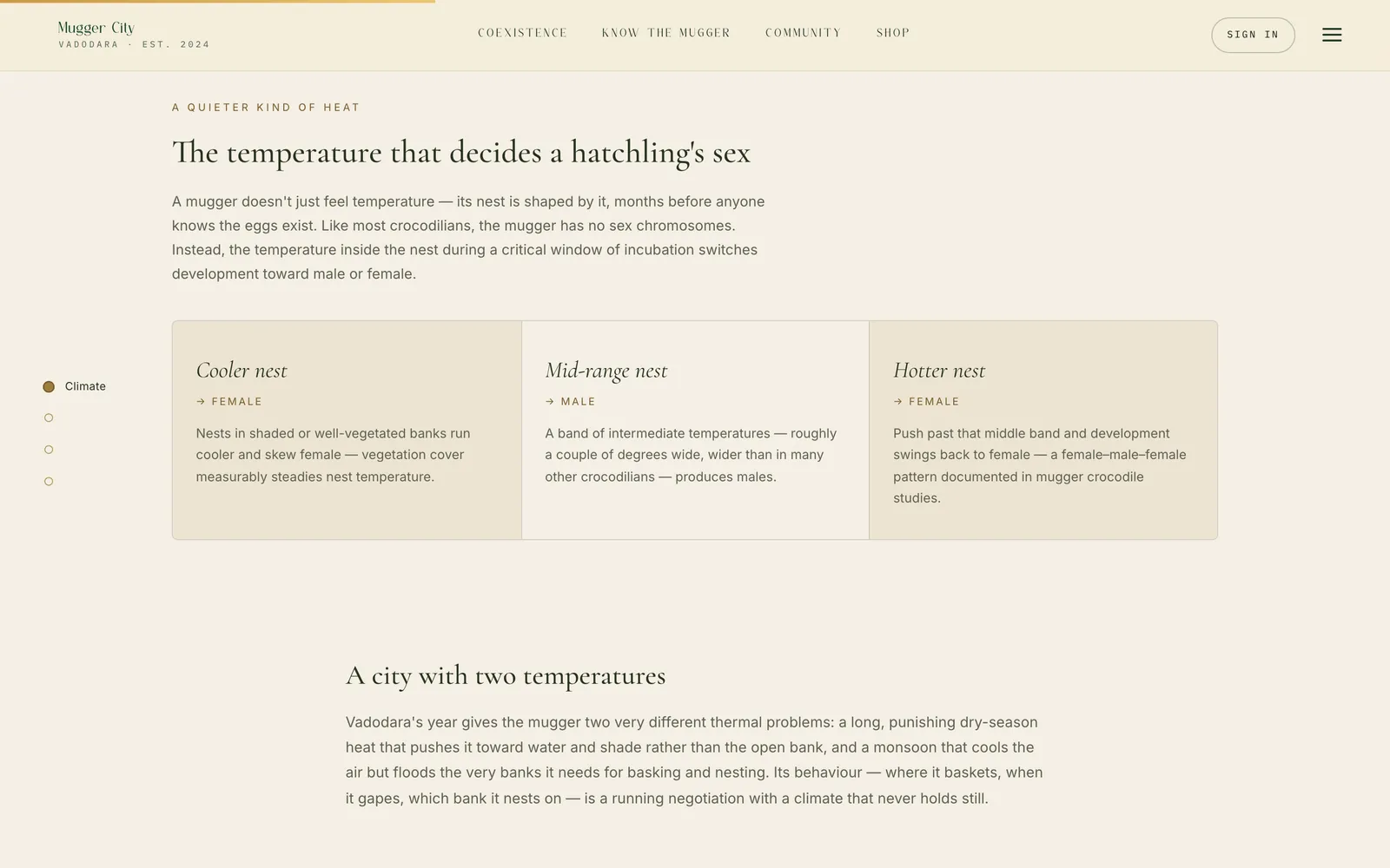
Three galleries you turn and rotate by hand — evolution, an anatomy x-ray, the life cycle — then four chapters to read: climate, the excretory system, myths versus facts, and twelve facts to carry to the riverbank.
-
Coexistence
The ten-minute read: one documented night in Malataj, the makara in Gujarati temple carving, and how a river that was never fenced ended up with an unwritten agreement holding on it.
-
Rescue, safety and conservation
What happens every monsoon when the river rises, what to do in the minutes after you see a mugger on land, and the Schedule I and IUCN position behind all of it — with the real helpline numbers as tap-to-call links.
-
The community wall
A contribution surface: photographs, paintings, poems, field notes, sketches and sound, filterable by kind and sortable by newest, top rated or trending, with an account behind it.
-
The Pond Shop
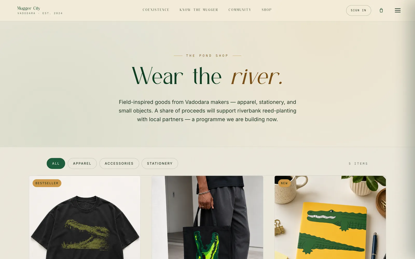
A small storefront — five items across apparel, accessories and stationery, with categories and a bag. The one part of the site that asks for something rather than handing something over.
Why these interactions
Three of the site’s interactions carry real explanatory weight. Each one exists because the alternative — writing the same thing as a paragraph — would have been worse, not because it looked good in a prototype.
-
Tap a bend, not a map tile
The river is drawn as a single line with five markers. Tapping one swaps in that neighbourhood’s panel — its kilometre mark, its count, its character. An embedded map would have been more accurate and less legible: the point is not where the river is on a satellite, it is that the river is a sequence, and each stop is different.
-
Galleries you turn by hand
Evolution, anatomy and the life cycle are the three things that are genuinely hard to hold in a paragraph — a 230-million year timeline, a body under its own skin, eight stages in a loop. All three are built as things to move through rather than read, and the page says so up front: “three hands-on galleries you turn, toggle and rotate by hand”.
-
Four steps and a phone number
The safety guidance is the one place where the reader may be standing in front of the problem. So it is the one place the site stops being discursive: four numbered steps, then three real helpline numbers as tap-to-dial links, then the line that actually matters — if anyone is hurt, call 112 first.
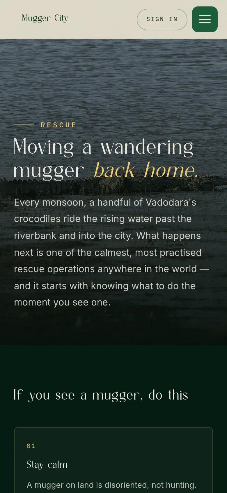
tel: links, so a tap dials.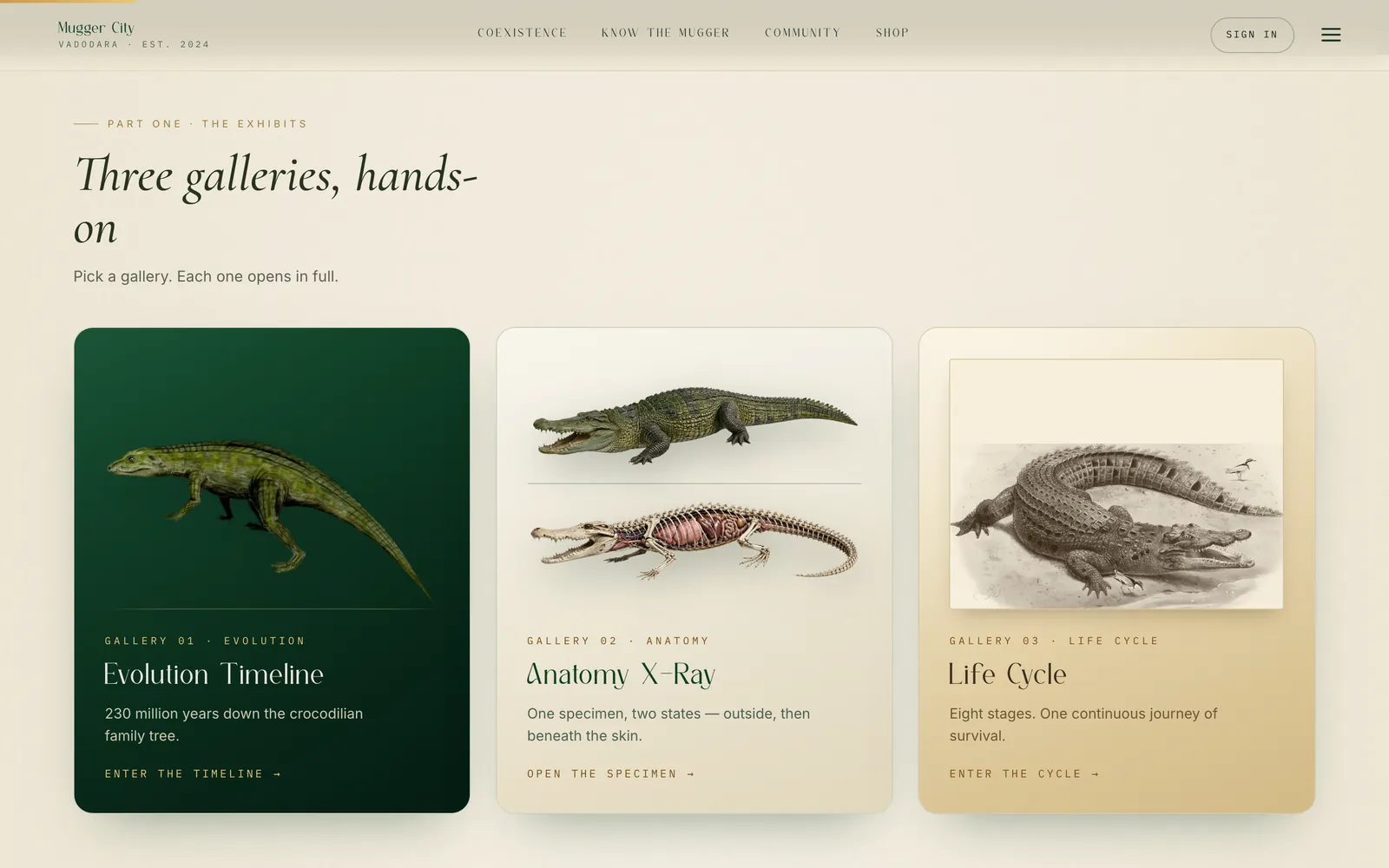
The visual system
Three typefaces, three jobs.
Cormorant Garamond carries every headline and every display number. It is the reason the site reads as a guide rather than a campaign — a serif at that size says “this was written”, where a heavy grotesk would say “this is messaging”.
Inter does the reading. Body copy only, at a measure short enough to stay a column.
IBM Plex Mono does the labels — KM 11, RECORD · 01, CITY HEART, MUGGERS 90+. This is the whole field-notebook idea in one decision: the structure is carried by small monospaced labels, tracked wide, so the prose never has to explain where it is. It also does most of the work of making the numbers look like they were recorded rather than written.
Colour, and where it comes from
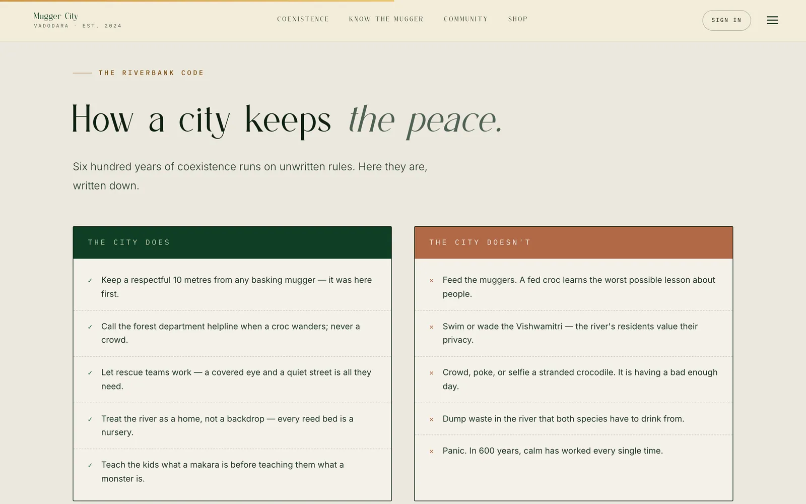
The palette is the river: a deep green-black ground for the photographic sections, a pale unbleached paper for the reading sections, and one gold that appears only on the italic half of a headline and on the small stuff that has to be found. Warnings on the riverbank code are the only place a second accent is allowed, and it earns it — that panel is the one place the site is telling people not to do something.
Photography, given room
Every section that can carry a photograph carries one at full bleed with the headline laid over it, rather than cropped into a card. The images are Wikimedia Commons contributions, credited in the footer of every page and again, by photographer name and licence, in the field sources — which is the subject of the next section.
Saying how sure it is.
The hardest decision on the project was what to do about the numbers.
“Three hundred crocodiles” is the sentence the whole site hangs on, and there is no census behind it. There are local surveys, rescue records and regional reporting, all of which say hundreds, none of which say three hundred and four.
There were three options. Drop the numbers and lose the only thing that makes the scale land. State them flatly and hope nobody asks. Or state them and say exactly how confident they are.
The site does the third, in three separate places, which is why this gets its own section rather than a footnote:
- The census block carries FIGURES ROUNDED & ILLUSTRATIVE on the same line as the headline, with its sources linked.
- The bend-by-bend breakdown explains its own arithmetic out loud: the markers come to 280, not 300+, because each stretch uses its recorded minimum. A reader who adds them up and finds they do not match is not catching the site out — the site told them first.
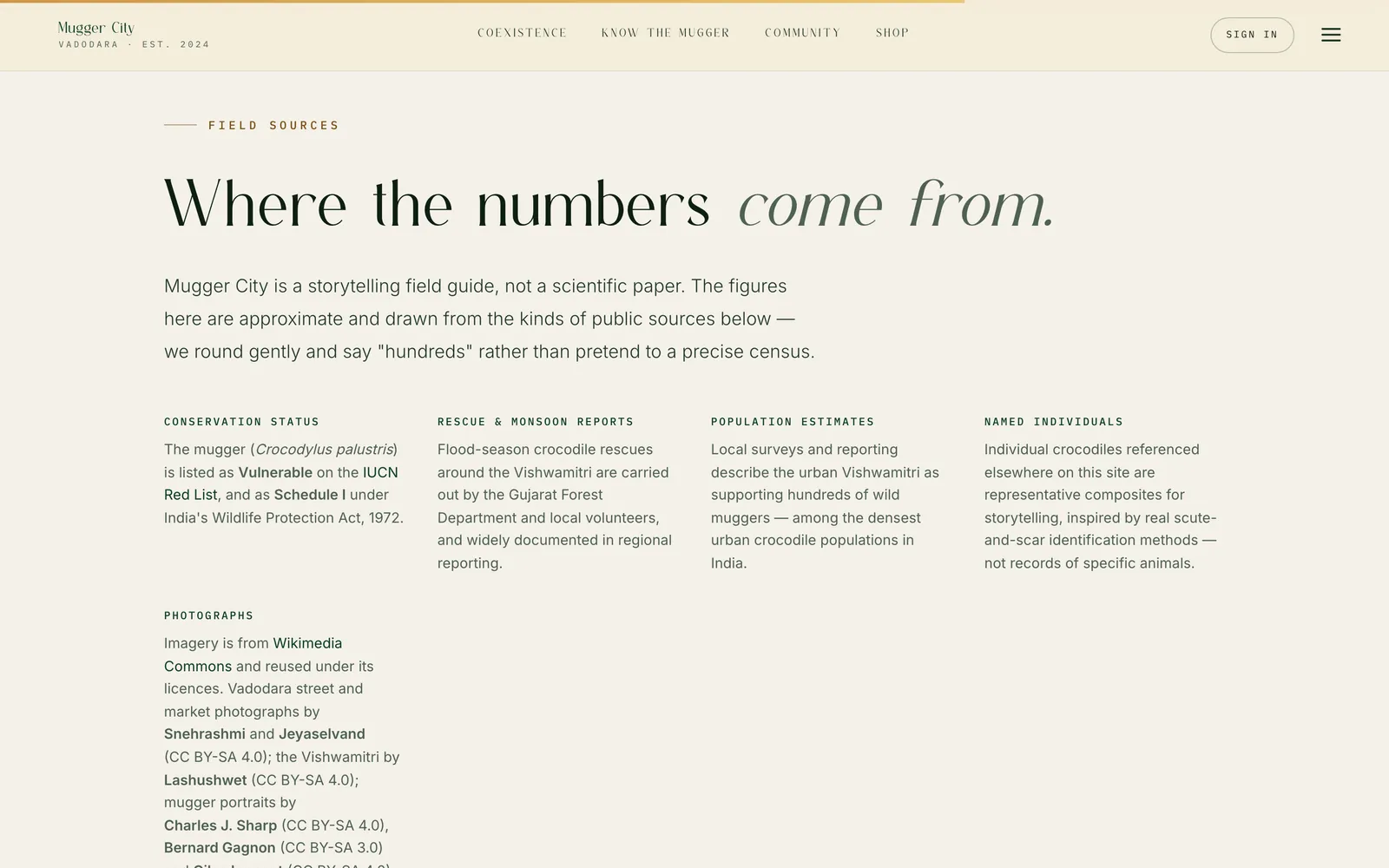
- The field sources page says it plainly: a storytelling field guide, not a scientific paper — we round gently and say “hundreds” rather than pretend to a precise census.
The same page discloses something it would have been very easy to leave out: the individual crocodiles named elsewhere on the site are representative composites, inspired by real scute-and-scar identification, not records of specific animals. That is a genuinely costly admission — named animals are the most shareable thing on a site like this — and it is made on the site itself, unprompted.
Every other decision on this project is a design decision. This one is an editorial one, and it is the difference between a field guide and an aesthetic about a field guide. A site that will not say how sure it is cannot be used for anything — and the whole point of a guide is that someone uses it.
The build
Eight pages of hand-written HTML, CSS and JavaScript. No framework, no bundler, no component library. The stylesheets are split by concern rather than by page — tokens.css holds the design tokens, style.css the components, motion.css everything that moves, with motion.js beside it. Keeping motion in its own layer is what makes it possible to reason about, and to switch off.
The rest of the JavaScript is one file per job: nav.js for the header, auth.js for the community wall’s sign-in, and the page scripts. Google’s translate widget is wired in for Gujarati and Hindi — a pragmatic choice on a site about Vadodara, where a hand-maintained translation of eight long pages would have gone stale within a month.
The same argument as this portfolio
It is not a coincidence that both sites are hand-written static files. For a site whose content changes rarely and whose pages are each genuinely different from one another, a framework buys very little and costs the entire build pipeline. What ships is what is on disk.

Where it stands
Eight pages are live at mugger.city (opens in a new tab): the homepage, coexistence, know the mugger, explore Vadodara, rescue, conservation, the community wall and the shop. Three galleries, six reading chapters, a five-stop river map, a twelve-record fact set, a translated interface and a working contribution flow.
There are no traffic figures here, and there will not be until there is something real to report. What can be said is that the thing exists, it works, and every claim on it is sourced or disclosed.
The shop does not fulfil orders yet. Its own copy says the reed-planting programme a share of proceeds will support is “a programme we are building now” — present tense, on the page, rather than claimed as already running.
The community wall is seeded. The works on it are starter content, not a history of public contributions. The mechanism is real; the audience is not there yet.
The named individuals are composites — disclosed on the site, and the right call, but a real gap. Actual scute-pattern records of actual animals, made with the rescue volunteers who already recognise them on sight, would be the single strongest thing this project could add next.
Nobody signed a treaty. They simply stayed.Mugger City · Coexistence
The live site
Go and see it.
The case study is the short version. The site is eight pages, and the galleries only make sense with your hands on them.