Case study · 02
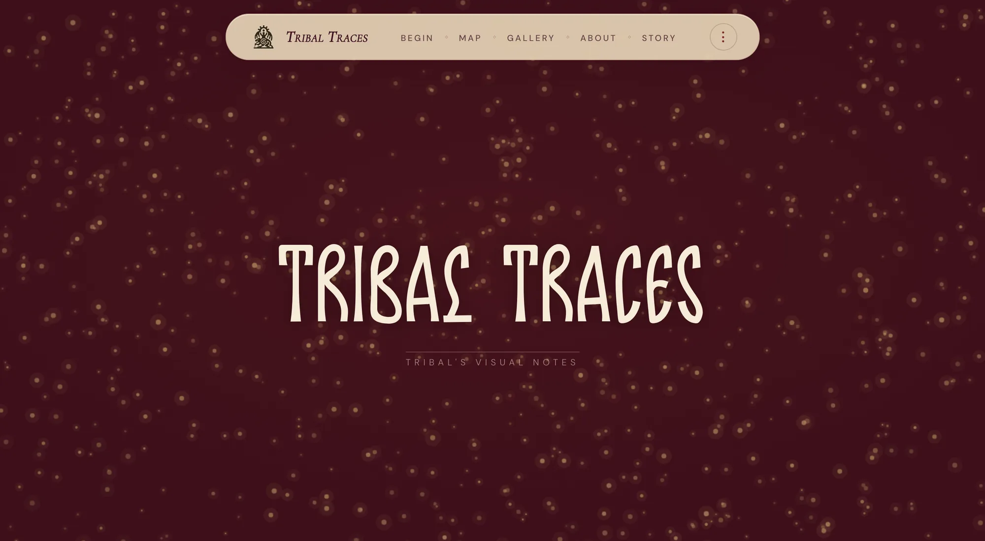
Tribal Traces.
An archive of Indian craft, a hundred and twenty-three chapters deep, reached through a map of India drawn one dot at a time.
What it is
Pick a place on the map. Read its craft.
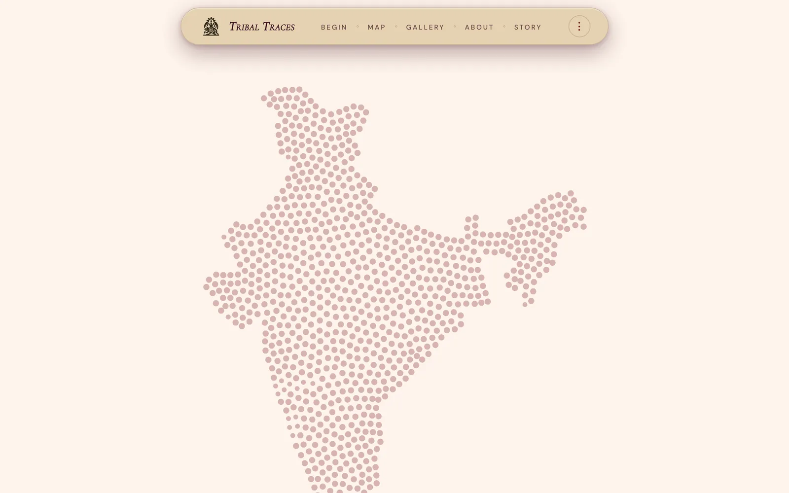
Tribal Traces is a long-form archive of Indian craft, organised by geography. The entry point is a map of India rendered as a field of dots; from there you go to a state, then a city, then a single craft tradition and the people who keep it.
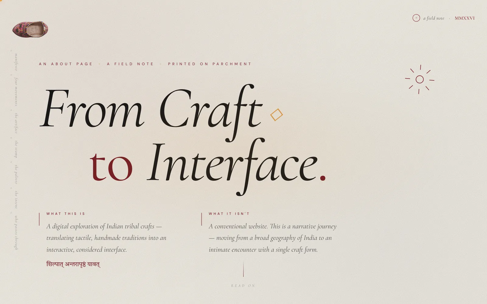
It is 131 pages. A hundred and twenty-three of them are chapters — Ajrakhpur’s block printing, Bishnupur’s terracotta, Kanchipuram’s silk, Lachung’s high-valley weave — across twenty-six states and union territories. The rest are the things that hold it together: a threshold, a map, a gallery, a story, and an about page that is really a design brief.
One per city or region, each with its own craft.
From Ladakh to Tamil Nadu, Gujarat to Nagaland.
The guided tour is narrated in English and Hindi.
Modelled objects you rotate in the gallery.
Counted from the repository, not estimated — 131 HTML files, 8 of them hubs or utilities.
The problem.
India’s craft traditions are not undocumented. They are scattered — a museum label here, a district gazetteer there, a tourism board page, a PhD thesis, an artisan’s Instagram. Each piece is about one thing, and none of them is about the shape of the whole.
The consequence is that you can only look something up if you already know what it is called. If you know the word “Ajrakh” you can find Ajrakh. If you have only ever seen the cloth, or only know that something is made in Kutch, there is no door.
So the decision that shapes everything else is: the map is the index. You do not need to know a craft’s name to find it. You need to be able to point at a part of the country.
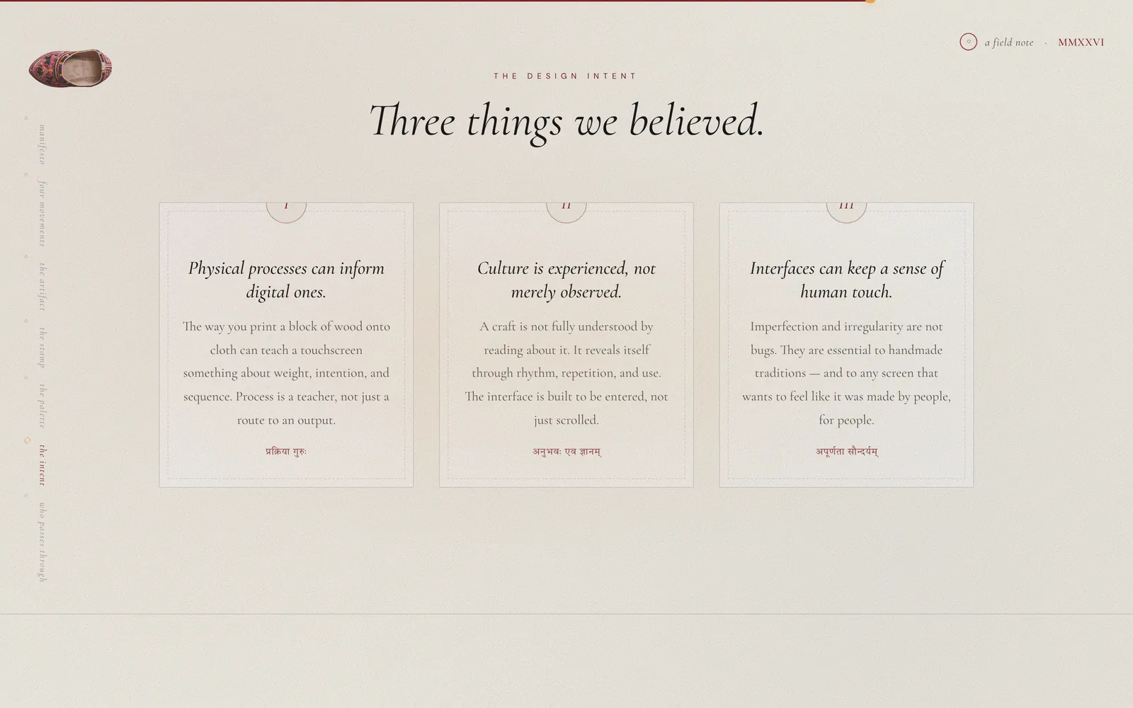
Geography is not a decoration here — it is the scaffolding of the narrative.Tribal Traces · About
Four movements
The whole experience is built as one continuous zoom, from the largest possible view of the subject to the smallest. The project names the four stages itself: map → craft → artifact → interaction.
-
I · The map
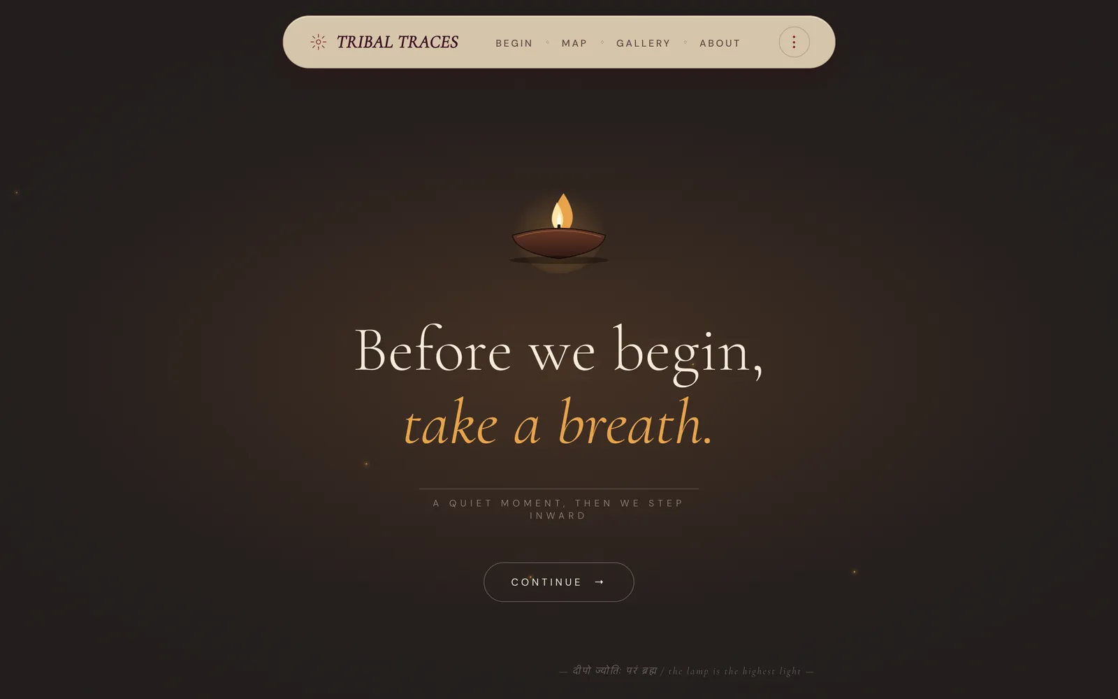
index.htmlIndia, seen from far above. Each state is an entry point into its own regional traditions.
-
II · The craft
123 chapter pagesA city, a tradition, the materials and the hands. The land leads; the story follows.
-
III · The artefact
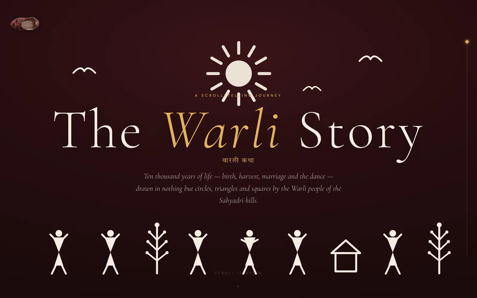
gallery.htmlA 3D object, abstracted from Pithora painting, that you rotate yourself. The pivot of the whole thing.
-
IV · The interaction
about.htmlA stamp pad. Every click lands slightly rotated and off-centre, never identical — the logic the rest of the experience runs on.
The project’s own words: “This artifact is the pivot. Everything before it is about looking. Everything after it is about touching.” It is a genuinely useful way to structure an archive — the first half earns the reader’s attention, the second half asks for their hands.
The map is made of dots
Not a map tile. Not an SVG of a border.
India on this site is a field of individually placed dots, and each state is its own array of coordinates. The comments in the source say where they came from: 874 dots extracted from gujarat-dots.png, MAHARASHTRA DOT MAP (~888 dots), MADHYA PRADESH DOT MAP (~885 dots), JAMMU & KASHMIR DOT MAP (~236 dots), then two further batches for every remaining state. A dotted PNG was drawn per state and its dots were read back out into coordinate arrays.
That is an enormous amount of work for something a GeoJSON border would have done in an afternoon, and it is the right call, because a border is a political object and this archive is not about borders. A dot field says things are distributed across this land, which is the actual subject. It also makes the map behave like the rest of the site: every dot is a discrete, hand-placed mark, exactly like the stamp pad, exactly like a block print.
On top of the dot layers sit the interaction: a hover state that names the region in a label at the top right, a toggle between hover modes, and per-state detail maps that replace the national view when you commit to a state.
Those coordinate arrays are why script.js is 6,409 lines. Most of that file is not logic — it is map data living in a source file. It works, and it is honest about what it is, but it is the first thing that would move to a .json next to it if this project were picked up again.
What a chapter looks like
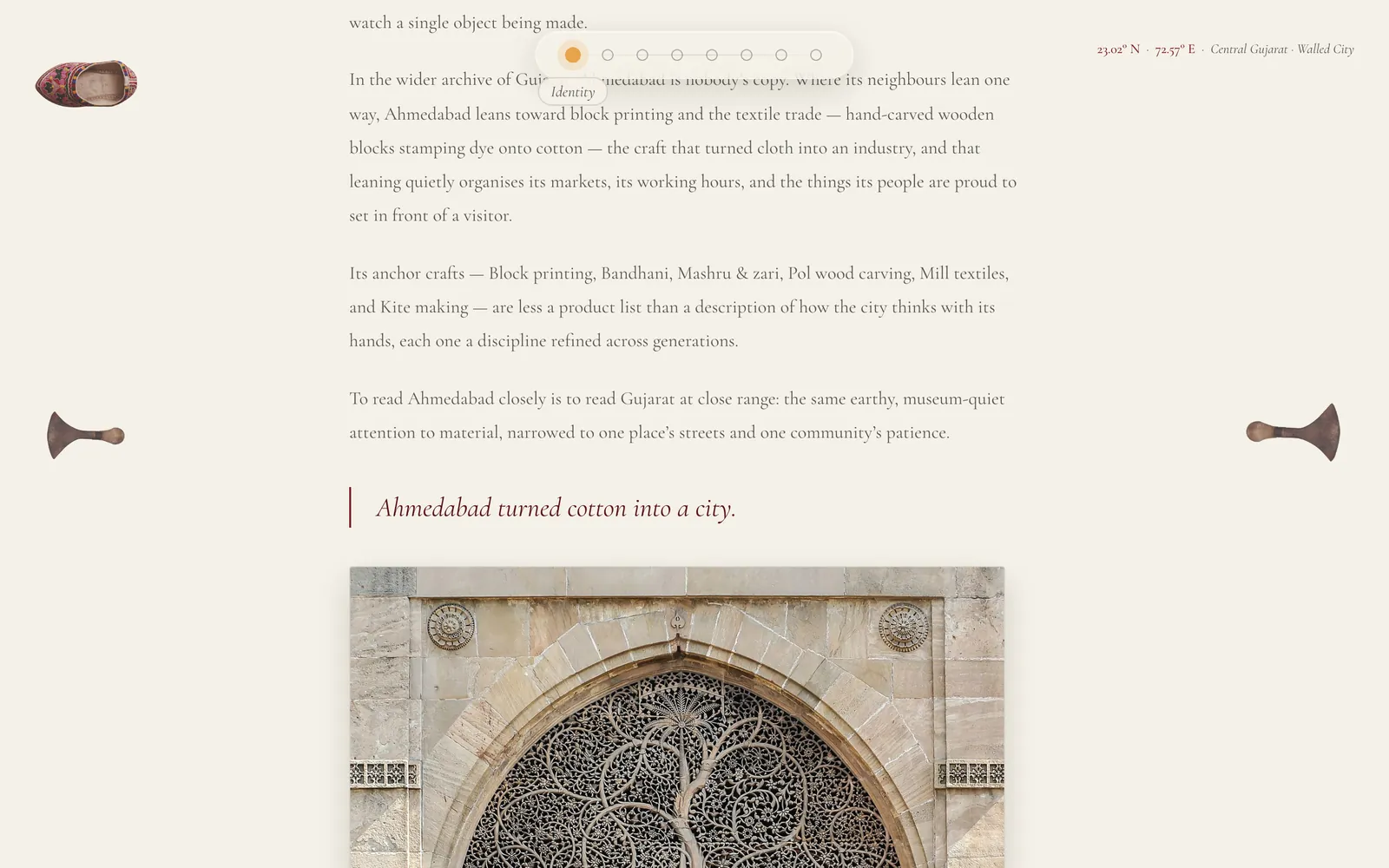
Every chapter opens the same way, and the consistency is the point at this scale — a hundred and twenty-three pages that each invented their own layout would be a hundred and twenty-three separate things rather than one archive.
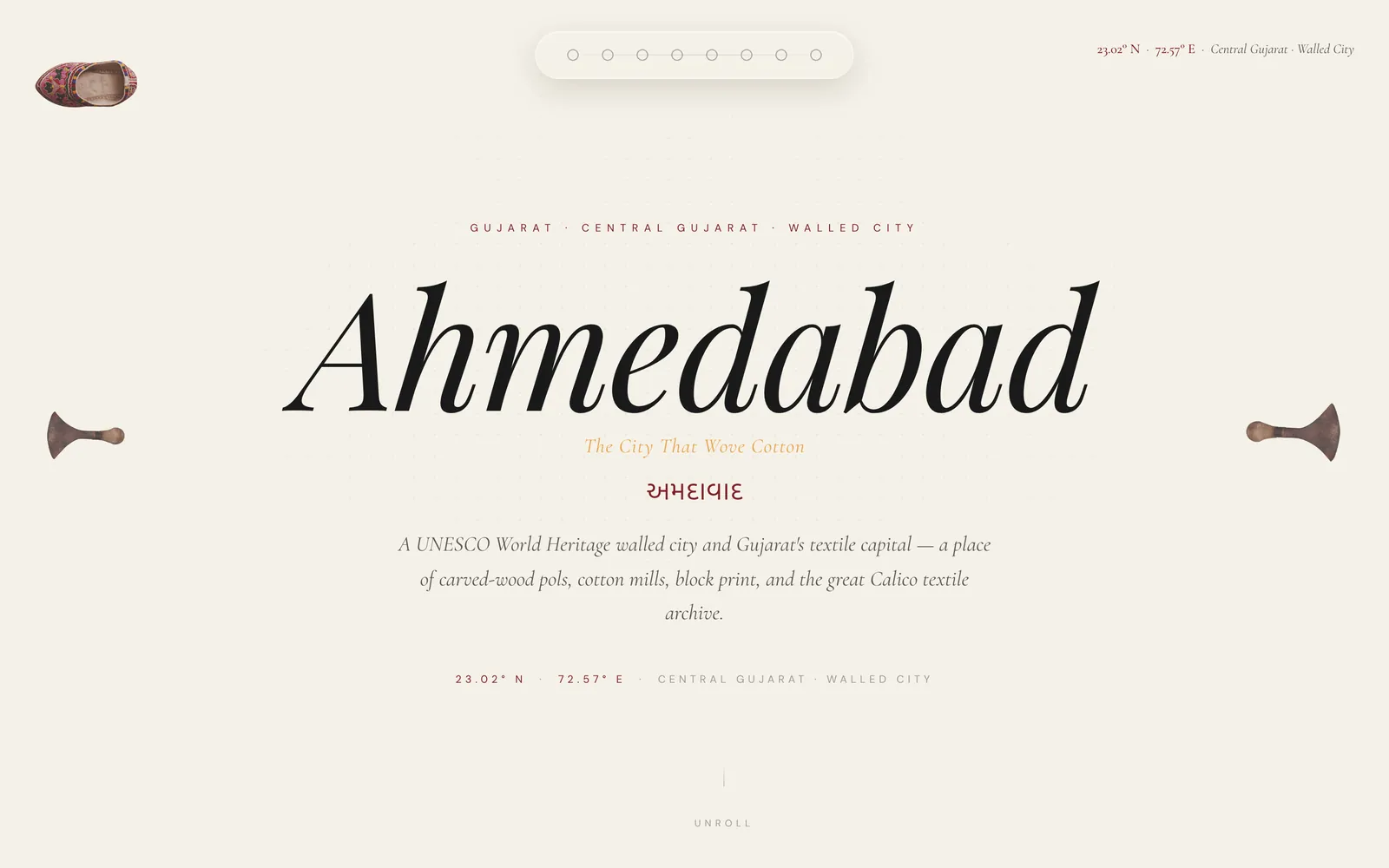
The header carries the city in a large serif, a one-line epithet (Ahmedabad — The City That Wove Cotton), the name again in its own script (અમદાવાદ), a short standfirst, and then the coordinates and the administrative location as small tracked labels. It reads like a plate in a field guide, which is deliberate: the same page shape has to work for a walled city in Gujarat and a monastery market in Sikkim.
The body below it alternates prose with full-bleed photography and the occasional pulled line. Arrows on the left and right edges move to the previous and next chapter, so the archive can be read sequentially as well as jumped into.
The site gives its own tour
The most unusual thing in the build is the guided tour. Start it and the page locks its own scroll, a narration track begins, and the site then drives itself to match what is being said.
It is a timeline, keyed to the audio’s own currentTime, with events that fire as the narration reaches them:
- 1:22 — scroll far enough that the particle field has fully assembled into the India constellation.
- 1:54 — scroll to the interactive map section.
- 1:59 — programmatically click a Gujarat dot, so the map zooms exactly as the voice describes zooming.
Each event fires once and is reset when the tour restarts. Escape quits. The timeline itself is about a dozen lines of plain JavaScript — an array of times, a requestAnimationFrame loop comparing each against audio.currentTime. No library behind it.
The two controls that make it usable
Language. The narration exists twice — rec1.mp3 in English and rec1hindi.mp3 in Hindi — and the tour swaps the source before it starts rather than shipping a second site. For an archive of Indian craft, an English-only guided tour would have been a strange thing to build.
Speed. Six playback rates from 0.25× to 3×. The scroll events key off audio time rather than wall clock, so slowing the narration slows the whole tour with it and nothing drifts out of sync.
An archive this large has a cold-start problem: a visitor arrives, sees a dotted map, and has no idea what any of it is for. Writing “click a state” on the screen is the usual answer. This one shows you instead, in your own language, at your own speed, using the real interface rather than a video of it.
The visual system
Every colour had to come from somewhere.
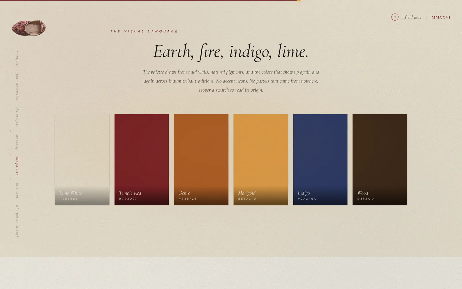
The palette is six colours, and each one is named for the material it came out of rather than for its position in a scale. Lime White is the lime-washed wall of a village home. Temple Red is iron oxide. Ochre is river silt. Marigold is turmeric and saffron. Indigo is fermented leaves and cold water. Wood is the loom, the block and the door frame.
The site states the rule out loud: “No accent neons. No pastels that came from nowhere.” Hovering a swatch shows you its origin. That is a small thing and it is the whole discipline of the project in miniature — the interface is allowed to borrow from the craft, but it has to say what it borrowed.
Two scripts, on purpose
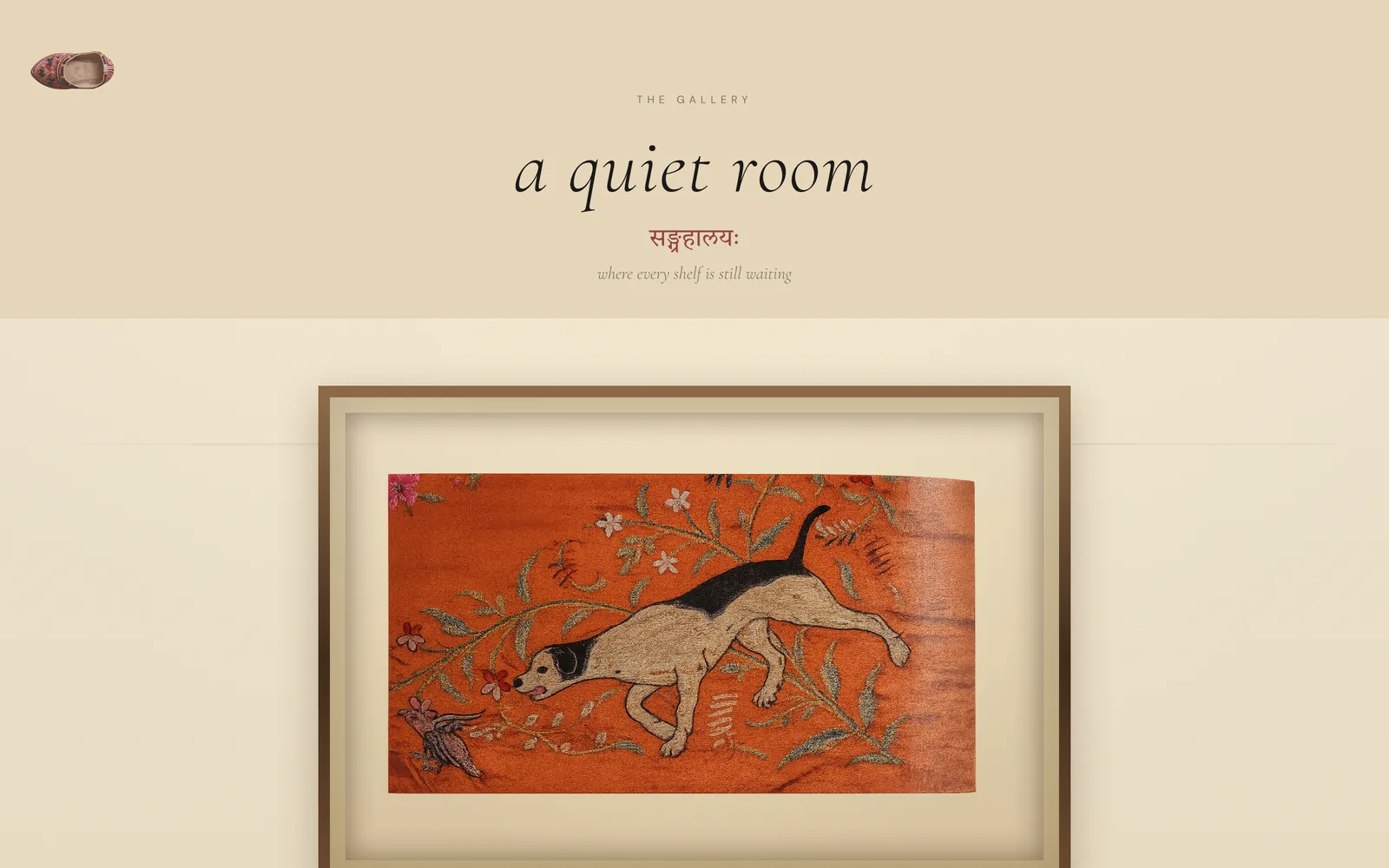
Sanskrit and Devanagari run alongside the English throughout — मार्गः beside “the shape of the journey”, सङ्ग्रहालयः beside “a quiet room”, and each chapter city’s name in its own regional script. It is not translation; the English is not a reduction of the Sanskrit or the other way round. It is a second voice, running quieter, and it is a large part of why the archive does not read as a tourism site.
What it cost to build this way
Tribal Traces is hand-authored. There is no template system, no content model, no build step — a hundred and twenty-three chapter pages are a hundred and twenty-three HTML files. That is what made the visual density possible, and it is also the bill.
-
Every page is its own page
A change to shared chrome — the nav, the footer, a meta tag — is a change to 123 files. The structural consistency across them was held by hand, and it held; but nothing enforces it.
-
Map data lives in a script file
6,409 lines of script.js, most of it coordinate arrays rather than logic. It loads on every page, including the 123 that never draw a map.
-
The gallery is heavy
The five .glb models it loads come to 220 MB, on one page. One of the five is already an optimised variant — 10 MB against its original’s 17 MB, both still on disk — which is the proof the same pass would work on the other four.
None of this is hidden and none of it is fatal. The archive works, it is live, and the density that the hand-authored approach bought is real — a templating layer added at the start would very probably have flattened the pages into each other.
The honest summary is that this project traded maintainability for range, knowingly, and the bill comes due only if it is extended rather than left as it is. The 3D gallery’s weight is the one item that costs a visitor something today rather than a maintainer something later, and it is the first thing on the list.
Where it stands
Live and complete at rudrahmedabadi.com/tribaltraces3: 123 chapters, the dot map and its per-state detail views, the threshold, the 3D gallery, the Warli story, the about page, and the bilingual guided tour.
Every one of the 123 chapters does carry a route back to this portfolio, in the footer credit line — a fact worth checking rather than assuming, because an earlier audit of this repository recorded the opposite. What it is, though, is a byline, not navigation: it says who made the page, not “here is the rest of the work”. And four of the hub pages — about, gallery, story and the threshold — do not carry even that.
So the bridge exists in one direction and is thin. This case study is the other half of it.
Optimise the gallery models before anything else. The 17 MB → 10 MB pass that was already done to one model, applied to the other four.
Move the dot arrays out of script.js into data files loaded only by the map page, so 123 chapters stop shipping a map they never draw.
Promote the footer byline to real navigation on the chapters, and add it to the four hub pages that have none — which would, of course, mean editing 127 files by hand.
The hand still thinks through the screen.Tribal Traces · About
The live archive
Start at the map.
The case study is the short version. The archive is a hundred and twenty-three chapters, and the tour will walk you into it.